‘ve always been a huge purveyor of the personal project. This hobby/obsession of mine first reared itself sophomore year in college, when I was determined to have more projects to … Continue reading Personal Projects: A Designer’s Secret Weapon
‘ve always been a huge purveyor of the personal project. This hobby/obsession of mine first reared itself sophomore year in college, when I was determined to have more projects to … Continue reading Personal Projects: A Designer’s Secret Weapon

Having branded 70+ small photography businesses, I’m pretty comfortable working off of conceptual information (as opposed to the typographic stuff that leads the way in terms of identity design) when … Continue reading Creating a Brand Without Typographic Inspiration

When I wrote my type/appropriateness article, I never expected to encourage multiple conversations on the topic of one typeface: Comic Sans. I’ve gotten into a few debates over comic sans, … Continue reading Fontroversy: What’s the Deal with Comic Sans?

This week contained so many small victories, spread over every aspect of my life. Picked up some new clients, a surprise job offer, a 20 lb weight loss, and it’s … Continue reading This Week in Awesome // Inspiration

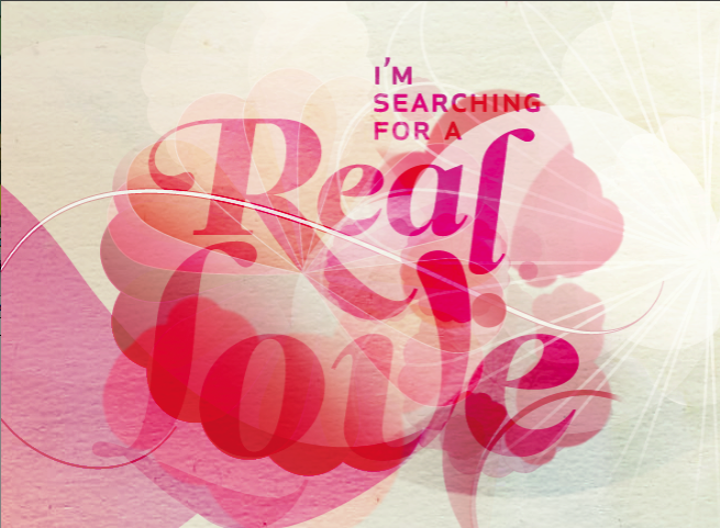
A year ago I had the opportunity to become a remote design director for a team in Eastern Europe. Of course I snatched that gig up– It’s a great … Continue reading The Designer’s Ethics
The debate over legibility and readability may at first come across as a debate over oranges and oranges. While these two aspects of typography are related, they are never the less separate in how they need to be considered.
First a bit about the terminology:
Legibility refers to the ease in which letters within any given typeface can be recognized. It describes- in short- the basic design of that typeface. The amount of legibility needed is determined by its purpose, but they mainly have larger counters, the open spaces in letters such as ‘a’, ‘b’, ‘d’, ‘o’, as well as a larger x-height.


Readability refers to how easily words, short phrases or blocks of text can be read. Readability talks to how the type looks on the page or screen. This is where people come to talk about typography being ‘transparent’, in that the reader should simply be encouraged to read comfortably, rather than notice the typeface outright.
A lot of factors come into play when working with the readability of fonts, most of which I covered in my basics of kerning/tracking article, but there is always more to say when it comes to the field of typography!
Layouts


How you manipulate the information in any given space will ultimately have a huge effect on the readability. Toss in images, colors and grid layout, and you are just adding insult to injury if you aren’t careful with how you present the information. Make sure you work with a structured grid that includes ample white space around each element. Focusing on the alignment of elements, their spatial flow on the page or screen will also aid in the overall readability.
Color

When you talk about typographic color, you talk about the density of type on the page. Remember the old squint test for rivers that also works for kerning? It’s a useful tool that comes in handy here as well. If things are too visually dense, they will be murder to read; let alone comprehend.

When you work with visual color (the reds, blues, greens and yellows we all know and love), the effect on readability is tremendous. Never set type using complementary colors, ie red type on a green background. The tones will simply vibrate back and forth so furiously, it’s as if the type produces it’s own strong buzzing sound to accompany this striking visual.

Using white text on a black background can also greatly influence both the readability and legibility of a typeface/copy. Fonts that feature high contrasts in their strokes (such as Bodoni, or Didot) will be difficult to read when they’re knocked out at small sizes; as well as fonts with a lot of detail, such as an old english or blacklister typeface.

Measure


Measure refers to the overall line length in a block of text. Through researching this riveting topic, I’ve found that 45-75 characters long is what you should aim for, and 66+/- the ideal. Characters means including spaces and punctuation marks– the whole shebang. If the line lengths are too long, the eye will tire and it will be difficult to keep your place while you read. If you’re working with multiple columns of text, you’ll want to be mindful of that too; keep your line lengths to around 40-50 characters.
Case

That’s right, uppercase, lowercase, small caps, all caps; this is what we’re talking about. I’ve read that lowercase is the most readable in larger blocks of text, and uppercase is the most difficult to read. The theories I’ve come across is that it forces the type block to read as a solid rectangle, rather than the varied spaces created by the upper case/ lower case combinations. Perhaps this is where small caps originated from. Small caps is usually a font within a typeface family, created to balance out the proportions of the letterforms in a way where call outs and special sections of information could be typeset, providing a variety within similar restraints.
Font style/weight

Along with the everything else, manipulating the options surrounding the typeface such as bold/italics/oblique/roman will change how readable your text is. Roman/book weight is the most readable, which most likely speaks to the preconceived notion that serifs are better for print. This is basically the standard in the US, going back to the idea that the serifs end caps that situate each letter creates additional space between the word; thus increasing the readability within the natural typeface. However in Europe, it’s equally acceptable to typeset books in sans serifs as well.
Italic faces should be used in small doses as the slant and personality of the face detracts from its legibility. It’s why you’ll mainly see small captions, or little snippets of information set in an italics.
And just so I can get it out there, italic and oblique faces do very much differ: Oblique typefaces use the same roman glyphs, they’re just distorted in order to slant at a right angle.
Italic faces use a stylized form of calligraphic writing to create a cursive typeface within the same family of the roman counterpart, but the upper case letters are usually obliques of the roman forms.
Contrast

Like color, the contrast you work with your type determines how readable it is. I’ve read black type on a white background is the easiest to read, but I sometimes find black too harsh. A great medium would be a 60-90% grey; giving the rich contrast of the black and white combination, but none of the potential harsh effects.
Type choice
You know I had to go here, let’s not even mince words about it. You wouldn’t drive a golf cart down the interstate,and you would never drive a ferrari through a golf course. Likewise, you wouldn’t set a book in Jokerman. I’ve said it before, I’ll say it a hundred times, fonts have their appropriate uses, but it’s also not necessary that all type needs to be legible.

Display faces are designed in order to be attention grabbing and distinct; riddled with personality. Legible faces are designed to get as much information absorbed into the reader as possible. Use display faces where the best use of that font, for this particular message, to shine the brightest, and use legible faces when you need your message to be understood. At the end of the day, these legibility kings are serifs and sans serifs.

Verdana, a typeface revered for it’s legibility in small sizes was created for the screen specifically in mind. Factoring an overall ‘openness’ within the typeface allowed for smaller sizes to be read just as easily as larger set type of other fonts. It also has wide counters keeping the letters quickly recognizably.


Georgia, a serif used for screens is a serif that also featured lowered x-heights and wider counters to increase legibility, as well as keeping the serifs fairly blunt and short. Held up against Times New Roman, Georgia is larger with a greater x-height at the same size.
So, which is best? Serifs or Sans Serifs?
They’re both awesome! At small sizes, the serifs can become too crunchy and start bloobiling into each other, which is what makes sans serifs look so appealing. However, sans serifs can be a little dry– and let’s face it, boring– so in larger spaces, like headlines or call outs, the subtle and restrained details of a serif are king. What started us all on this sans-for-screen movement is hopefully an archaic happenstance at this point, but it was the pixelation of serifs on our old 800×600 resolution monitors and the problem this created for us. Designers created anti-aliasing, which allowed the pixelated details of fonts to be smoothed (or made super blurry), we even created bitmap fonts, designed off of square proportions that could be read at incredibly small sizes. Thank goodness we swapped all of that out for the clean lines of Verdana and Arial, Georgia, are all the standards today. I’d like to hope that in our technologically advanced time we’ve moved beyond this problem, but I know that there are still people out there with dinosaur bones; I just pray they don’t wince too hard when the anti-aliasing comes into play.
That’s the run down on legibility, readability and the ways to work within the rules to make your designs the most effective. What typefaces have you found to be the best in terms of legibility/readability?

I thought I would continue the type-love train, focusing on the rules of typesetting. When it comes to setting type, typing just straight into Illustrator or Indesign does not cut … Continue reading A Look into Typesetting

This project has been an interesting ever-evolving challenge. Finally coming up to the stage where I need to start thinking about displaying the large batches of info, I now have … Continue reading Inspiration: The Kubrick Project’s Imagery

Now that all the technical stuff is out of the way, I thought I would discuss combining typefaces; the do’s, the dont’s, and of course the why’s that go along … Continue reading The Art of Combining Typefaces

Anyone who knows me pretty much at all, knows that I am a HUGE dork for typography. What can I say? I am totally in love with letters, and all … Continue reading jne talks type pt 1
